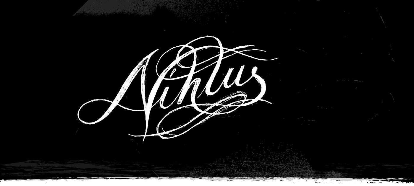
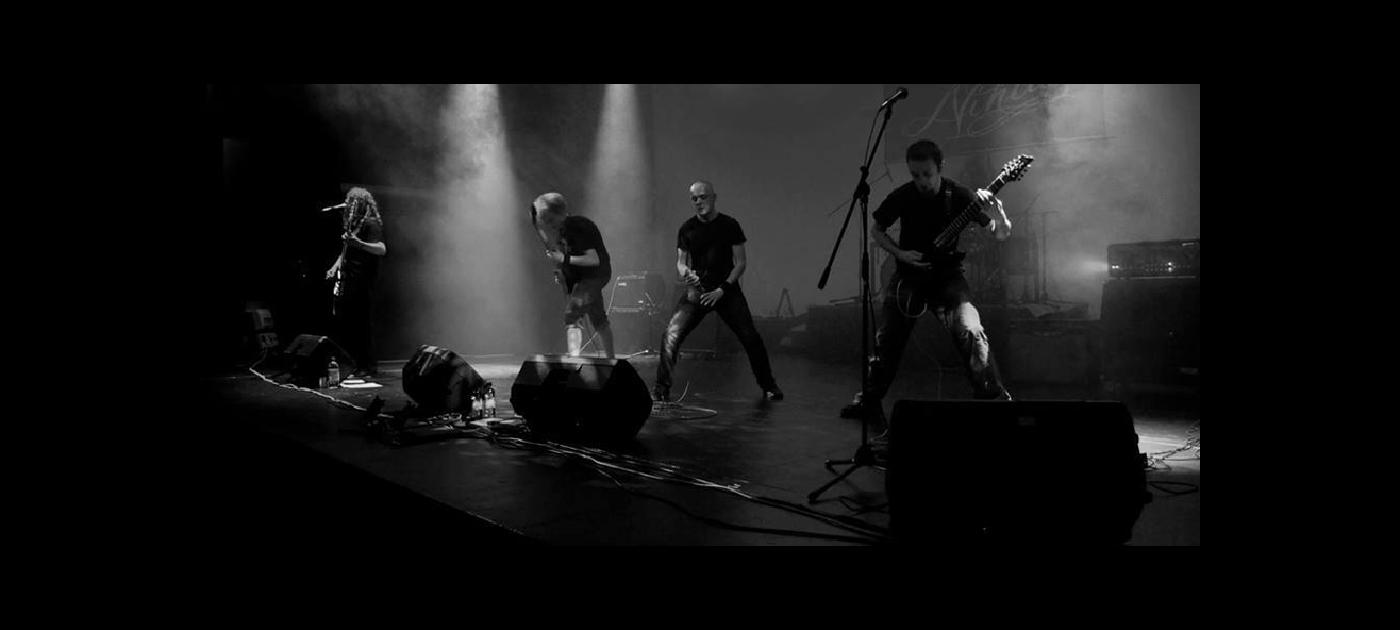
Nihlus
Heavy metal band identity
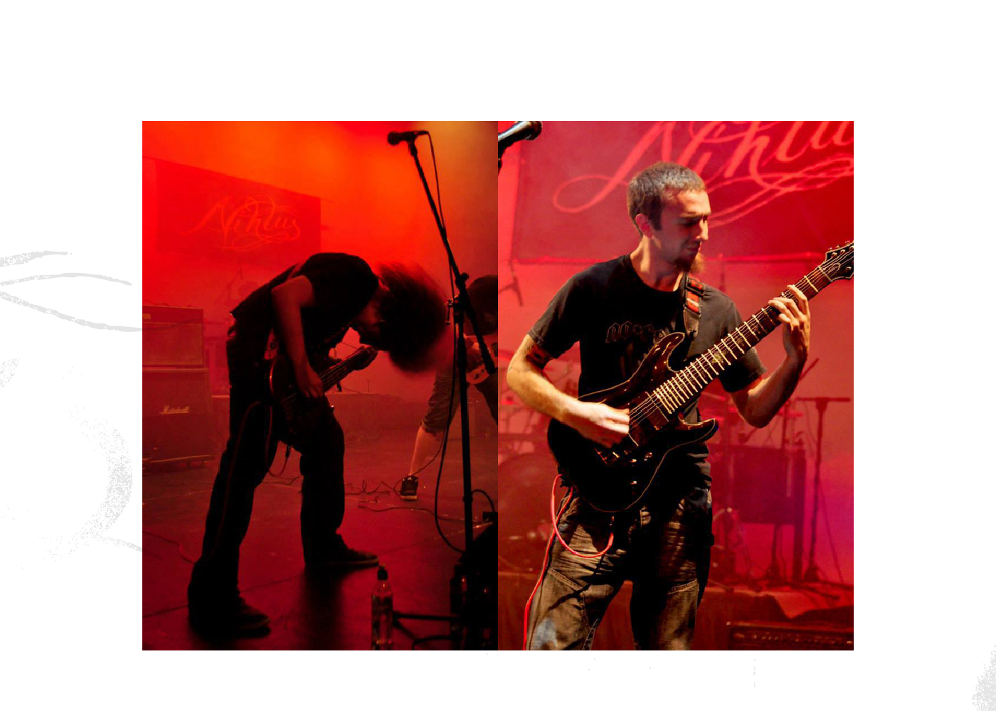
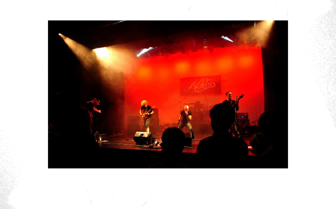
The progressive heavy metal band Nihlus had recently formed in 2011, and, a little while later were looking for a brand that fitted with the attitude and style of their music. Typical of many newly-formed bands, budget restraints were tight and the timeframe was much the same.
Solution
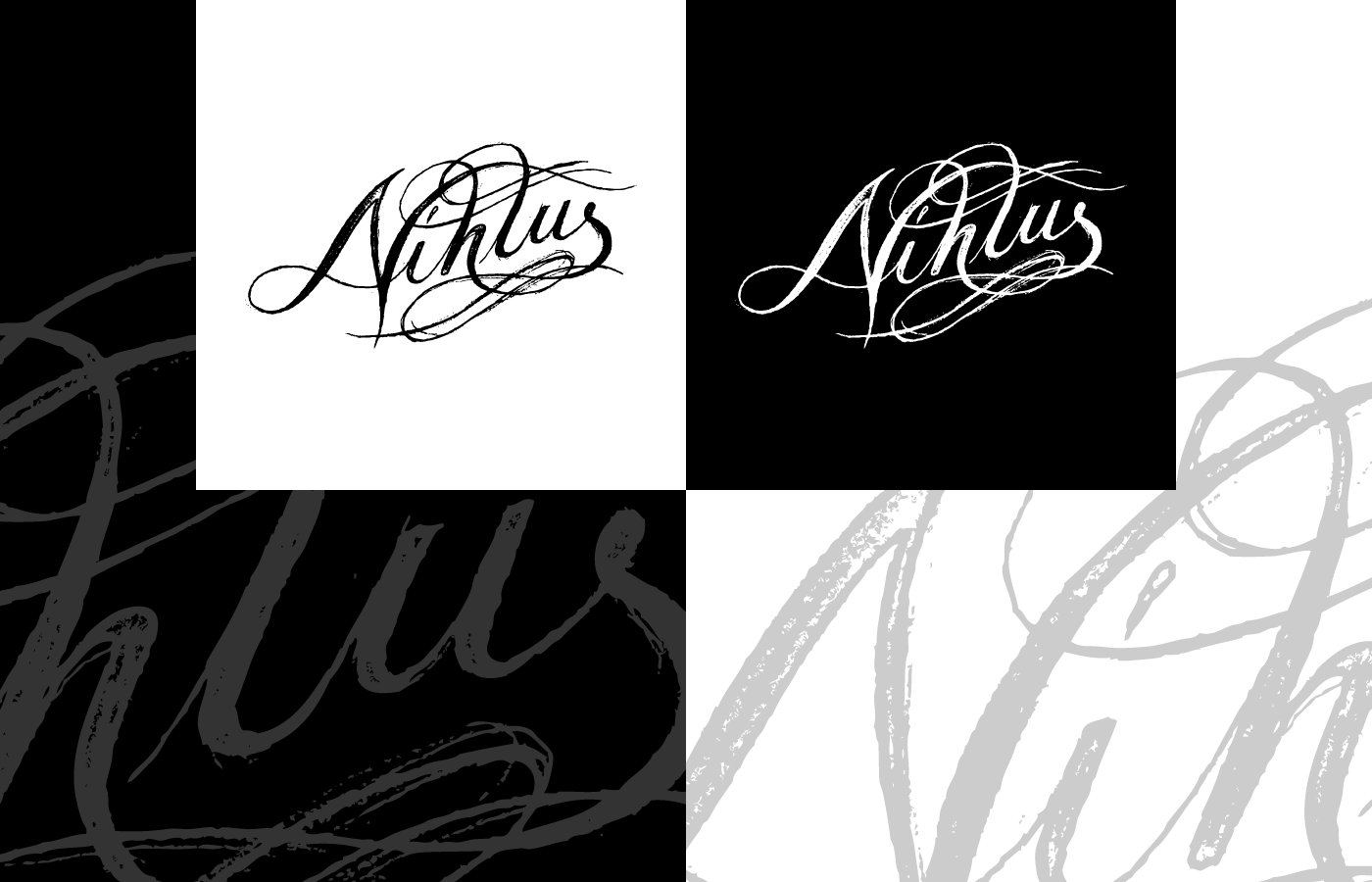
It was clear from the beginning that a clean, minimalist logo wasn’t going to be appropriate. So, working closely with one of the band members it became apparent that a freer, hand lettering style was more fitting for the free, progressive attitude of the band.
Originally, the intention was to render the sketched letterforms using digital media to neaten the edges, line work and kerning. But, being enamoured with my sketch I was asked to leave the sketch as it was because the rough, hand-drawn marks just seemed so well suited that the sketch was left un-rendered and pressed into service.