It's Peachy Down Under. A blog about moving to Australia.
Branding & Custom Lettering
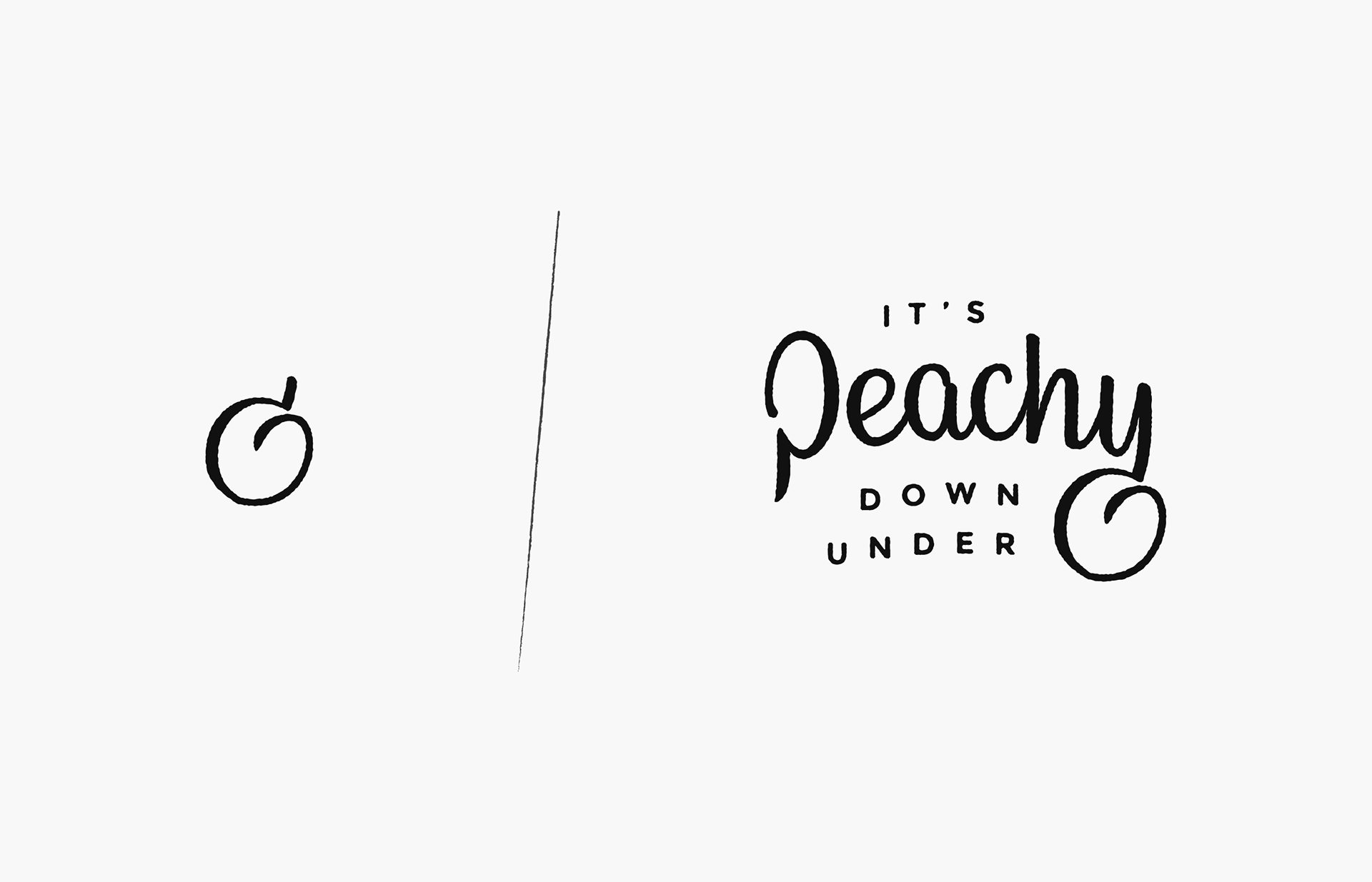
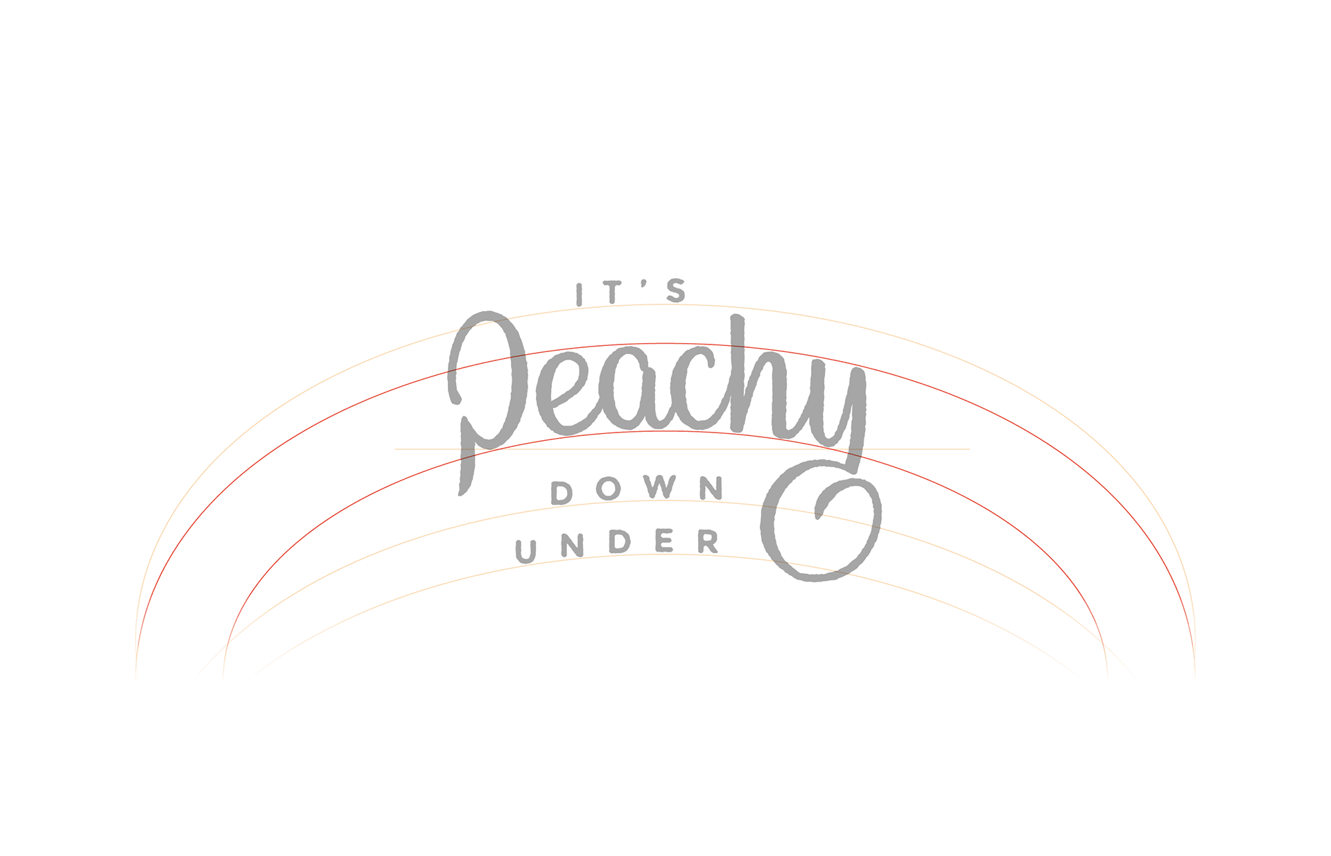
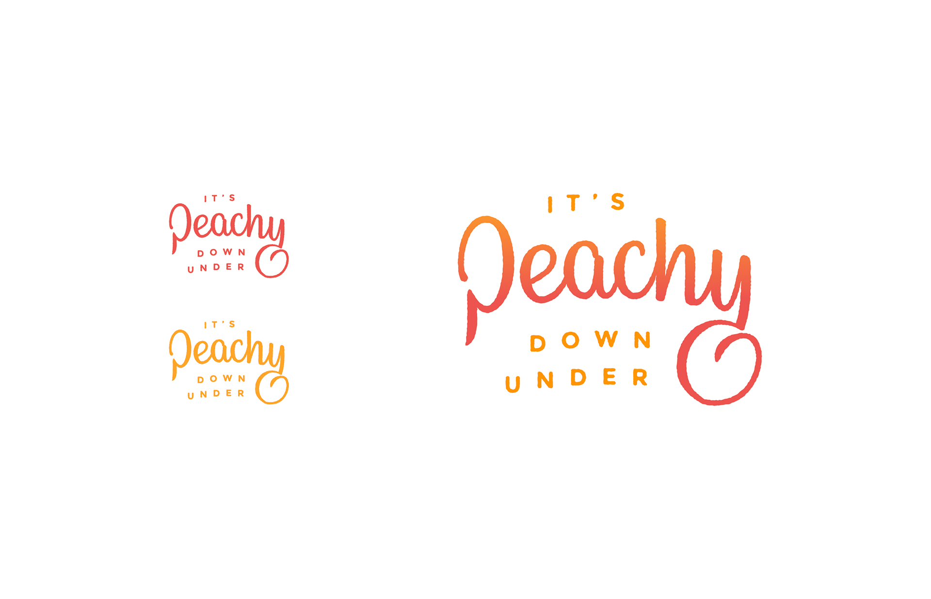
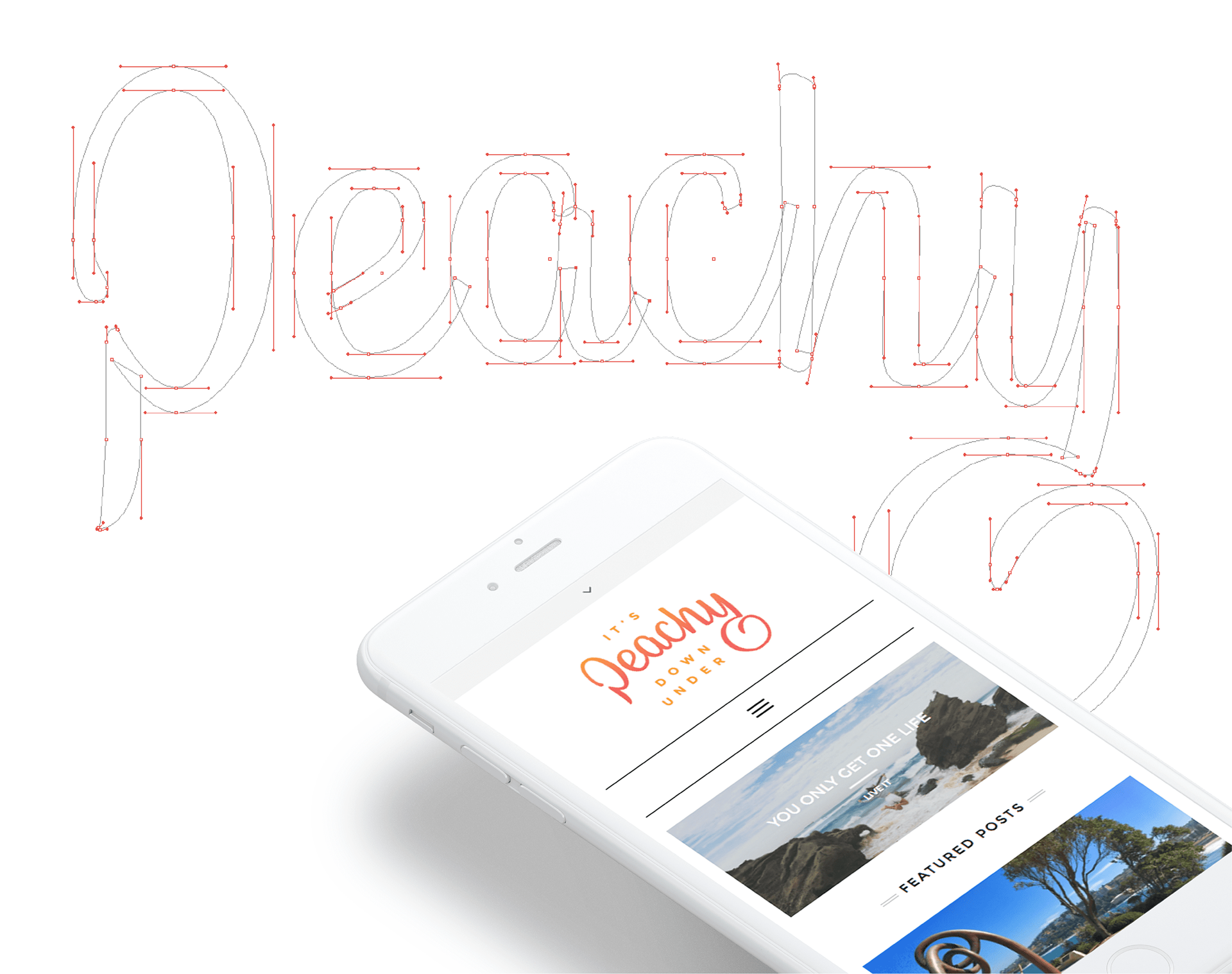
Wanting to share her insights into moving from England to Australia, Beth (a.k.a. Peachy), decided to launch her own blog. With the name of the blog being based on her name, it provided a strong starting point and visual cue for the brand. Wanting to avoid any obviously cliché icons, I designed a custom typographic word-mark with a flourish suggesting a peach. The flourish is also used as stand alone icon.
The WordPress blogging platform is a perfect fit for Beth to deliver helpful tips, tricks and any other experiences encountered when starting her new life down under. The branding plays of this affable approach with hand-made custom typography keeping a human touch throughout.